Agnes Callard
The Missing Shade of White
2025
Would you rather see the world in black and white or live without music? This is one of my favorite questions. Most people tell me that they would give up color before giving up Bach and the Beatles and so on — except kids, who usually make the opposite choice. I’m with the kids, and I always have been.
In the third grade, we were asked to name our favorite book. Mine was The Wizard of Oz, because it was colorful. I remember how disappointed my teacher was to learn that I was referring to the brightly colored watercolor drawings in my edition of the book. The right way to use the word “colorful” to praise a book, she explained, is to describe distinctive or memorable characters, such as the Tin Man and the Cowardly Lion, or surprising and whimsical events, such as a house falling on a witch, as being, in a metaphorical sense, “colorful.” The Wizard of Oz was good because it was colorful, but not in the superficial way I meant it. This was the same teacher who got annoyed when, having told the class to draw a picture of spring, she observed I had drawn a metal coil. (The possibility of drawing trees and birds and sunshine did occur to me, but that seemed harder, and I am not good at drawing.) There is a flat literalism to the way I think, and there is a flat literalism to color as well: somehow, color flattens the world. The puzzle is that it also, at the same time, enlivens it.
The movie version of The Wizard of Oz builds a bridge between literalists like me, and sophisticates like my third-grade teacher. Dorothy starts out in the sepia-toned plains of Kansas, a world of dirt roads and open sky and old scattered farm equipment, and when the color gets turned on she is in a place chock-full of amazing, impossible wonders. The advent of color means the exit of the dull, the flat, the ordinary; with literal color comes metaphorical color. You can experience a version of the opposite when you switch the display of your phone or computer into black and white mode. Suddenly it is a much less appealing world to spend time in; you have drained it of life, even though it was never alive in the first place.
Color means liveliness, despite the absence of any correlation between how alive something is and how colorful it is: some colorful things are alive, some are not; some drab things are alive, some are not. When a given instance of color is very colorful, it is often described as vibrant, a word related to the word “vibrate,” as though the color were in the business of moving rapidly, even though it is not moving at all. Arguably, color is one of the things that never moves. Things that are colored can move, and your eye can move across a field of colors, but colors are no more capable of motion than numbers are capable of emitting smells. So here we have two features of color: it is flat and it is lively. This is not exactly a contradiction, but there is some kind of tension between the reality of color as literal, as flat, as shallow, as a property of the outermost surface of things, and our sense that color is a mark of liveliness, of vibrancy, of energy, pointing us to the life that teems deep within. I want to explain why I choose color over music; to do that, I am going to have to make sense of how color vibrates without moving.
Let’s start with a different question: which comes first, color or shape? You might think that this is a bad question, but Plato, a top questioner if there ever was one, disagreed. There are no fights about the chicken and the egg in the Platonic corpus, but there is one about the relative priority of color and shape. It starts when Socrates defines shape in terms of color: “Let us say that shape is that which alone of all existing things always follows color.” Socrates is saying that shapes precipitate out of colors, in the sense that we identify shapes by tracking color boundaries. Socrates’ interlocutor, Meno, calls this definition “foolish”: what if a person came along who claimed “that he did not know what color is, but that he had the same difficulty as he had about shape?” Meno is complaining: what if I were blind? So Socrates offers Meno a second definition: “shape is the limit of a solid.” But Meno is not satisfied and pushes Socrates to define color. Socrates complies: “color is an effluvium from shapes which fits the sight and is perceived,” by which he means that objects emit streams of tiny shapes, which we perceive as color when they enter our eyes. At this point, Meno is satisfied. He loves this definition, “This seems to me to be an excellent answer, Socrates.” And Socrates rebukes him for loving it: “it is a theatrical answer so it pleases you, Meno . . . it is not better . . . but I am convinced that the other is.”
The dispute between Meno and Socrates is this: Meno prefers to define color in terms of shape, whereas Socrates prefers to define shape in terms of color. Consider trying to actually use Socrates’ second definition of shape — “the limit of a solid” — in order to identify a shape. If Meno were blind, he would find the limits of solids by attending to tactile changes, but as it is, given that he is sighted, he relies on color differences. Socrates’ first definition stands behind his second one. Color is what helps us find limits. You are using color that way right now, to read these words. Maybe that will be easier to see with words you (probably) can’t read:
ἔστω γὰρ δὴ ἡμῖν τοῦτο σχῆμα, ὃ μόνον τῶν ὄντων τυγχάνει χρώματι ἀεὶ ἑπόμενον.
Look closely at those marks, and pay attention to where each shape comes to an end. Notice something? You keep running into color boundaries! The limit of each shape is the place where the color changes. Color lets us see shape. And notice that it doesn’t go the other way. If you look closely at the unprinted margins of this page, you’ll find you can attend to an indeterminately bounded patch of white within the larger, unprinted margin. You see the color of that patch — white — but not by seeing any particular shape. Color does not follow shape, shape follows color.
If you know ancient Greek, you may have struggled to overcome your inclination to read the sentence — which gives Socrates’ first definition of shape — instead of seeing its shapes. Even if you aren’t able to translate the sentence, you still had to fight against your recognition of many of the letters. That struggle is good practice for our next exercise, as we move into the third dimension. You are going to lift your eyes from this page, but before you do, instruct yourself to adopt an infant mindset. I mean: try to remember that once upon a time you didn’t know there were such things as books and carpets and windowpanes. Before you learned to parse the visual language of the spaces you are in, it was all Greek to you. Keeping that in mind, look up.
Welcome back. It’s time to reflect on your experience. How did your eye decide where one thing stops and another starts? It looked for color changes. Once again, shape boundaries track color boundaries. That’s the only way you get keyed into a new shape, at least if you are using vision. To see shape, you are forced to rely exclusively on color.
Shape is that alone of all existing things which always follows color. Every time I say this sentence to myself, it literally changes the way I see everything: instead of recognizing familiar groupings of familiar things, I find myself gazing at a sea of patterned color. If the definition favored by Socrates immerses me in the act of seeing, the one favored by Meno has the opposite effect. The shapes of which color is an “effluvium” must be so tiny as to be invisible, and when they enter my eye, they do so, in a sense, unseen. Meno is trying to get behind or underneath color experience; he is eager to move away from the vocabulary of the first person into terms that are abstract and alien, or, as Socrates puts it, “theatrical.” Socrates is encouraging us to dive into our experience, to allow it to make itself intelligible on its own terms. I could tell Meno’s story about color to a blind person, whereas in order to tell Socrates’ story about color, I had to get you to use your eyes.
A variant of the dispute between Meno and Socrates would recur, a few thousand years later, when Goethe resisted Newton’s conception of color. Newton understood color as a property of light, whereas Goethe insisted that color is a kind of subjective experience: the numerical wavelength of light might be a property of the light, but redness is a property of how things appear to the seeing subject. Wavelength is quantitative whereas red is a quality. Wittgenstein takes the side of Goethe and Socrates when he writes: “I don’t see that the colors of bodies reflect light into my eye.” Let us separate the question of what I see from the question of what happens — with light, and retinas, and tiny invisible shapes — when I see. Those inquiring into the second question will come upon all sorts of surprises, such as the surprising fact that white light can be split into the other colors of light, and surprises about whether light is a wave or a particle, about the structure of the eye, and of the brain, and so on. But these surprises are themselves unsurprising. When the journey is meant to end in a full understanding of the apparatus of seeing — the eye–brain interface, the surface, the light, and so on — we know in advance that it will be a long journey, full of alien and “theatrical” twists and turns. But if we turn our attention to the first question, the Socratic one, we don’t expect the unexpected. What do I see? The answer is color, and that is the end of the story, right?
Wrong.
In 1950, a year before he died, Wittgenstein was thinking about color, and his reflections were collected into a little book called Remarks on Color. The question that runs like a guiding thread through his remarks is: why isn’t there transparent white?
At first I took this question as proof that even great philosophers can ask bad questions, because there definitely is such a thing as transparent white. You can look down through the clouds from an airplane and see the world below through a whitish tint. And there is also frosted glass, and wax paper, and ice when it is filled with tiny air bubbles. And then I realized: those objects are not transparent, they are translucent. You can have milky white glass, cloudy glass, but the analog to that is milky or cloudy green glass, which is not the same as transparent green glass. Translucency blurs the boundaries of things, transparency does not. So I posed Wittgenstein’s question to a friend, and he said, “Of course there is transparent white!” I demanded he show me some and he promised to do so. He returned, hours later, defeated. He couldn’t find any, either.
Why isn’t there transparent white? This question became an obsession for me, as it was for Wittgenstein, who poses it over and over again, in many different ways. For example:
Why is it that something can be transparent green but not transparent white?
“White water is inconceivable, etc.” That means we cannot describe, (e.g. paint) how something white and clear would look, and that means: we don’t know what description, portrayal, these words demand of us.
Why can’t we imagine transparent-white glass — even if there isn’t any in actuality? Where does the analogy with transparent colored glass go wrong?
And it does not suffice to say, the word ‘white’ is used only for the appearance of surfaces. It could be that we had two words for “green”: one for green surfaces, the other for green transparent objects. The question would remain why there existed no color word corresponding to the word “white” for something transparent.
“Why then is transparent white impossible? Paint a transparent red body, and then substitute white for red!”
You might be inclined to say that it is obvious why there isn’t transparent white glass: a transparent medium filters out the relevant color and only lets that kind of light through, but white is all the colors, so “transparent white” glass can’t do any filtering. But then perhaps a clear transparent glass should count as “transparent white”? Yet it doesn’t. As Wittgenstein would say, look at it! Does it look white? (“We don’t say of something which looks transparent that it looks white.”)
Wittgenstein considers a potential rule for transparency: maybe transparent X glass, for any color X, has to change the colors of what is behind it so as to make white things X-colored, and it must make everything else appear in some shade between X and black. This rule does indeed work for “transparent red” and “transparent blue.” But then he has us imagine that there were a glass that drained the world of color, rendering everything black and white — I suppose it is the glass you would have to look through, for the rest of your life, if you opted for music. Viewed through this “decoloring” glass, as we might call it, whites are white, and everything else is in a shade from white to black. This glass should, by the rule proposed above, qualify as “transparent white.” And yet, notes Wittgenstein, we are not inclined to call it that, because whether or not something is white is not a matter of whether it satisfies some rule but, again, whether it looks white. Whiteness is not stipulative. But if it is not stipulative, then why would we assume that there would be a white version of everything? That is the real question.
Why should there be transparent white? Wittgenstein also notes that there are no luminous greys: “the fact that we cannot conceive of something ‘glowing grey’ belongs neither to the physics nor to the psychology of color.” Moreover, “a shine, a ‘high-light’ cannot be black.” And yet, he goes on to observe, “a flag may be yellow and black, another yellow and white.” White and grey and black are interchangeable on flags, but not when it comes to flames, or transparency, or shadows. When it comes to flags, anything goes, but when it comes to shines and shadows, only some things go. We should, I propose, be less surprised by the flames and shadows, and much more surprised by the flags: how marvelously unstuck their colors are! Transparent white is the rare exception to the rule that if you pick out almost any object in your visual field you can easily imagine it being a very different color from the color that it is. Pink squirrels? Sure. Lavender grass? No problem. Color is layered very thinly on reality, which gives it a life of its own.
Contrast sound. There is no single, unified way to refer to the sonic analog to “lavender” or “maroon.” We must mention both the pitch of a note — how high or low it is — and its timbre. Timbre picks out the difference between the same note played on a piano, or a flute, or sung by a human voice — each gives the note a different “coloring.” Notice that in order to refer to those different timbres, I have to refer to their causal underpinnings: the most natural way for me to describe the distinctive sonic quality of a trumpet’s blast is to mention the brass thing that produced the sound, namely the trumpet. The same goes for the other senses. I do not think that just anything can taste sweet — salt, for instance, cannot taste sweet. The fact that salt cannot be sweet, or granite cannot be squishy, does not induce in me the feeling of perplexity that I feel when I learn that what is transparent cannot be white. If I try to imagine a book that tastes salty or sour, I find that my mind has deposited a fine layer of salt or lemon juice on the surface of the book. The smell of a rose or the ocean is associated with a very specific thing, namely, a rose or an ocean. Against the backdrop of the causal embeddedness of our other senses, it is remarkable that we have such a concept as “red,” which requires no mention of tomatoes or fire or lobsters or Coca-Cola cans or carpets used for celebrities. I conceive of red as something in its own right, detachable from any of the objects that cause me to experience it. And this is, in general, how I think of color, as something that can be peeled off of reality, as something that inhabits a strange realm called “my visual field,” a mental arena to which there is no analog in any of the other senses. Is a color “patch” a piece of the world or a piece of my mind?
Had he not died a decade before it was published, I believe that Wittgenstein would have loved Josef Albers’ The Interaction of Color. Albers was a Bauhaus painter, printmaker, graphic designer, photographer, art educator, and color theorist — in sum, a practitioner of color. The Interaction of Color is not a treatise about color but a workbook filled with exercises designed to teach the reader to do something she thinks she already knows how to do, namely, see colors. The thesis of the book is in its title: colors interact. The interaction of color can cause two colors that are the same to look different, or several colors that are different to look the same — it causes “the Weber–Fechner Law,” which says that transparent colors must be layered upon one another geometrically in order to produce what looks like an arithmetic progression, and it causes “the Bezold effect,” by which proximate colors can lighten or darken one another. But the “most exciting of all color phenomena,” according to Albers, is an interaction effect that causes the vanishing of boundaries at the border between two different colors of equal light intensity. When Wittgenstein asks, “Why is green drowned in the black, but white isn’t?”, he is gesturing at Albers’ favorite interaction effect. As an artist, Albers is most famous for his series of paintings of nested squares called Homage to the Square, which makes frequent use of this same effect. Albers wrote, of his series paintings, “I’m not paying ‘homage to a square.’ It’s only the dish I serve my craziness about color in.”
Early in the book Albers makes clear that he is taking the Socratic path:
Our study of color differs fundamentally from a study which anatomically dissects colorants (pigments) and physical qualities (wave length).
Our concern is the interaction of color; that is, seeing what happens between colors.
We are able to hear a single tone.
But we almost never (that is, without special devices) see a single color unconnected and unrelated to other colors.
Colors present themselves in continuous flux, constantly related to changing neighbors and changing conditions.
In an early chapter called “a color has many faces,” Albers writes that “color is the most relative medium in art,” but it is not until the end of the book that he dares to explain what he means by this: “The purpose of most of our color studies is to prove that color is the most relative medium in art, that we almost never perceive what color is physically.” Albers is saying: we don’t see the colors that are there. What we see, instead, is the interaction between colors.
If this seems like a crazy claim, the book is filled with proof. The wonderful images in his book are sadly copyrighted, so I can’t reproduce them here, but here is an (inferior) example of my own construction. Take a look at this set of shapes:
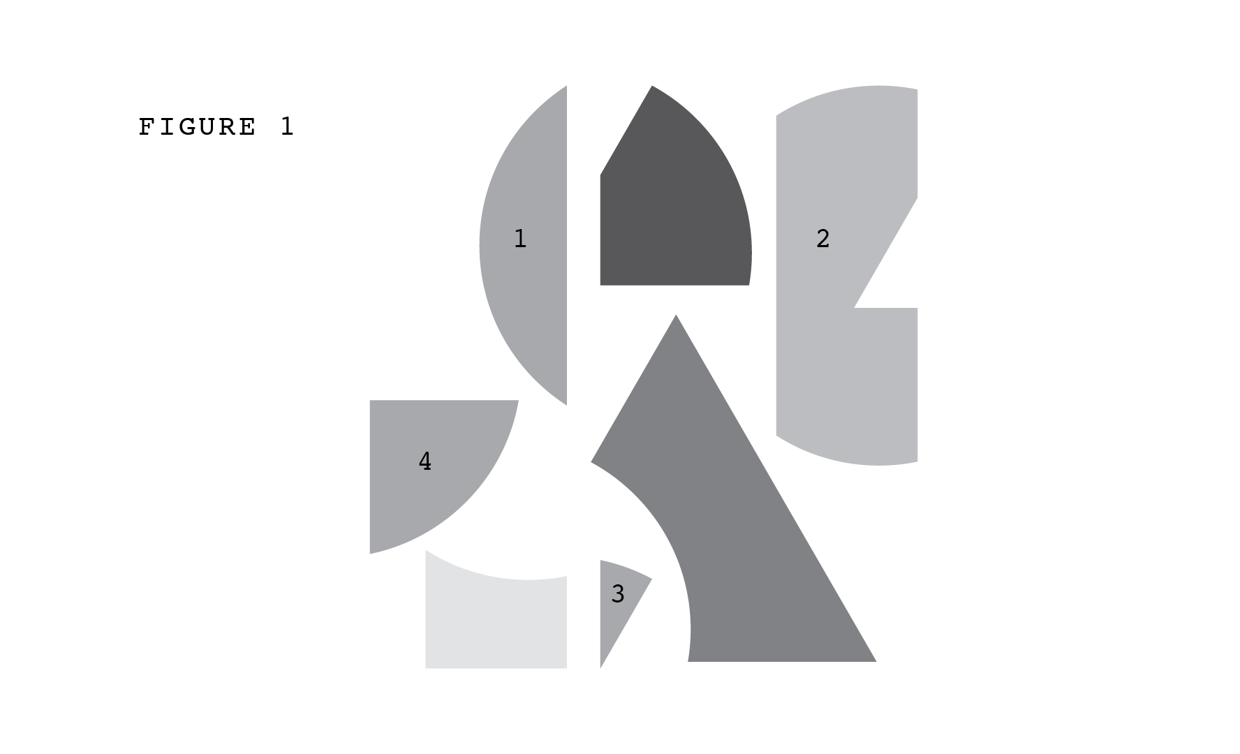
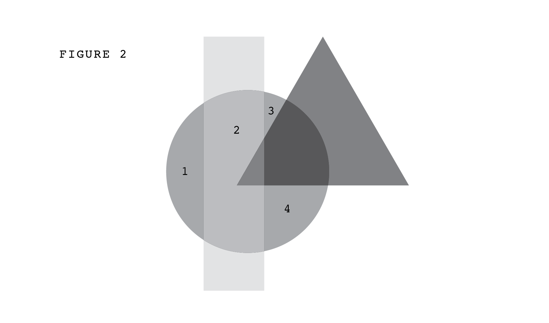
Ask yourself how hard it is to determine the relative color values of the shapes that I have marked 1, 2, 3, 4? Is 1 darker or lighter than 3? Is 2 darker or lighter than 1? Now look at Figure 2, where I have rearranged the same set of shapes. I have not adjusted their color values or even rotated them; I have simply changed their relative positions. Notice, first, that it is now easy to determine which is darker, and second, that in their new arrangement the shapes composing (what now appear as a) triangle and rectangle are transparent. Albers would chalk both of these differences up to the interaction of color. The colors in Figure 2 interact in such a way as to produce transparent color, and in such a way as to make it easy for you to tell that 1, 3 and 4 have the same value, whereas 2 is lighter.
My images echo a thought experiment described by Wittgenstein:
Imagine a painting cut up into small, almost monochromatic bits which are then used as pieces in a jig-saw puzzle. Even when such a piece is not monochromatic it should not indicate any three-dimensional shape, but should appear as a flat color-patch. Only together with the other pieces does it become a bit of blue sky, a shadow, a highlight, transparent or opaque, etc. Do the individual pieces show us the real colors of the parts of the picture?
Given that our color assessments are more accurate for Figure 2, why might we think that it is Figure 1 that shows us “the real colors”? The answer must be that “real colors” means “colors in the absence of interaction effects.” I believe that this is also what Albers means by “physically,” when he tells us that “we almost never perceive what color is physically.” Of course we cannot remove all interaction effects, because a color patch is always seen against some background. Figure 1 frames each grey shape in white, and in Wittgenstein’s example we must imagine that we are examining the painting fragments strewn on a rug or held up against a wall.
Still, we can remove many interaction effects by “deconstructing” an image: we can bring it about that we can no longer identify the blue as the blue of the sky, and no longer pick out items such as shadows or highlights, no longer distinguish between what is transparent and what is opaque. Wittgenstein points out that in a painting, a transparent object, such as a glass vase, will be painted using the same sort of paints as an opaque one, such as the table on which the vase rests. The “building blocks” of a transparent image will not be transparent. Figures 1 and 2 illustrate this as well: transparency is an interaction effect. We can chop an image up to the point where many such interaction effects are removed, even if not all of them, and we have the sense that this brings us closer to the “real” color. Oddly enough, the “real color” is not what we tend to see.
Once again it is worth noting that our atomism about color is unparalleled in our other forms of sense experience. We don’t instinctually decompose music or food into its component parts and claim that those components are what we are “really” hearing or seeing. That is why you didn’t notice that my initial framing — comparing losing color to losing music — was guilty of a lack of parallelism. Strictly speaking, the parallel to losing color is losing pitch and timbre, whereas losing paintings and stained glass windows should be on par with losing classical and pop and so on. But when I frame it in the first way, people translate pitch plus timbre into music — they care about being able to distinguish a voice from a trumpet exactly insofar as they care about being able to hear Bach. And framed in the second way the choice is too obvious, even for me: I would pick music over paintings, because so much of my aesthetic experience of color can be salvaged. It comes naturally to balance red against Bach, turquoise against the Beatles; somehow colors are on par with much more organized experiences of sound or taste. I own a book called The Secret Lives of Color, which contains hundreds of pages of detailed discussions of many colors, including sixteen shades of yellow and orange (amber, saffron, minimum ginger, orpiment, gamboge) — and yet it is missing my favorite yellow-orange, ochre. I could not imagine a book called The Secret Lives of Notes that discusses middle C as played on a piano versus A sharp on a flute. Who cares about notes? We care about flavors mostly insofar as they are clustered into foods, and likewise for textures, but ochre shows up for me as an important citizen of reality, it stands on its own two feet. We are blasé about the existence of notes we cannot hear (a dog whistle) but we feel very differently about the prospect of colors we cannot see. (Wittgenstein: “There is, after all, no commonly accepted criterion for what is a color, unless it is one of our colors.”)
In 2015, a picture of a dress worn to a wedding went viral because people could not agree whether it was blue and black or white and gold. A few years later, there was an analogous acoustic disagreement: in a brief audio recording, some heard “yanny” where others heard “laurel,” shortly followed by a variant with “green needle” and “brainstorm.” Notice: in the visual realm, we are torn between colors, in the auditory realm, between words.
A color is in many ways less like a sound, or a taste, or a smell, and more like a word. A word presents itself as separate from the causal structure that gave rise to it; it floats in the air, Homer observed, as though on wings. A word is also a unit — standing apart from other words — even though, as with color, we only ever encounter words in the context of other words, and the “interaction effects” are, to put it mildly, significant. When the person I am talking to is angry with me, or boring me, or I am in some way averse to the interaction I am in, the words they are saying sometimes materialize in the air in front of me. I see the words more than I hear them, and their presence comforts me, as though they were saying: you can interact with us instead.
Color both flattens and enlivens the world, and words do the same. On the one hand, it is a truism that there is much that cannot be expressed in words, that a word only conveys a whisper of the thing itself; on the other hand, when we do succeed in describing something that we previously found difficult to describe, or even just inventing a name for it, the phenomenon is thereby, in some sense, brought to life. Suddenly being able to speak something you couldn’t speak before is a lot like having it jump out at you, visually, in the form of a bright gash of pink, or a garish polka-dot pattern.
Your eyes show you a world of things, immediately, and in the same glance they show you color and shape and transparency and shine. Unless I am instructing you to perform strange Socratic exercises, you see everything together all at once. In a similar way, when you read this text, you access my thoughts, what I am trying to communicate, and you access my words and sentences and linguistic style, all together. Color is packaged with things as words are packaged with thoughts, but unpacking is a task one can take up, if one is so inclined. I am, in both cases, all the time: to be literal-minded is to be attuned to the superficial liveliness that buzzes all around you, because you have accepted the standing invitation to detach the surface from what is bundled with it.
Even when I am listening to it in public, music is private. By the time I hear it, it has already been granted direct access to my core, the place where my secret thoughts and hidden feelings lie; I locate it in my interior. But my visual field and the color patches that populate it are not private — at least not in that way. They are private in the way a private conversation or a private club are private: by invitation only. Music reminds me that I am alive, that I carry life within me, but a colored world presents itself to me as alive, as though it were talking to me. I want both, but if I have to choose, I would rather feel less life in me and more life around me.
Agnes Callard is a professor of philosophy at the University of Chicago. Her book Open Socrates: The Case for a Philosophical Life was recently published.
Also by Agnes Callard: